Data is Useless Without Insight
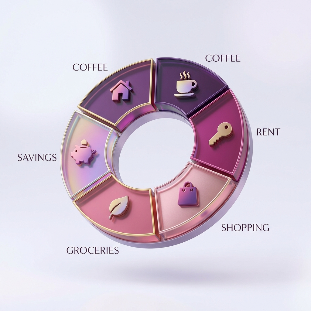
Many people track their expenses but fail to act on the data. They see a list of numbers but don't see the story their money is telling. DevinBook’s Category Distribution Pie Chart is designed to tell that story visually.
When you look at your dashboard, you shouldn't just see a total spent. You should see that 30% of your income is going to "Dining Out" while only 5% is going to "Personal Growth". This visual clarity is the catalyst for real change.
Optimizing Your Category Strategy
We recommend starting with broad categories and refining them over time. DevinBook allows you to create custom categories with unique icons, making your dashboard feel personal and intuitive.
- Fixed Expenses: Rent, Utilities, Subscriptions.
- Variable Expenses: Groceries, Transport, Entertainment.
- Investment Categories: Savings, Stocks, Professional Development.
Spotting the 'Spending Leaks'
A 'spending leak' is a recurring small expense that adds up to a massive annual total. By using DevinBook’s analytics, you can spot these leaks in seconds. That small daily habit might be costing you a vacation per year! Reclaim your wealth by mastering your category distribution today.