The Standard for Financial Software is Broken
For decades, financial software has been notoriously ugly. Clunky interfaces, gray spreadsheets, and rigid layouts were the norm. The underlying assumption was that because money is a serious topic, the tools to manage it must be visually austere.
At Devinsol, we fundamentally disagree. We believe that the tools you use every single day should bring you joy. That's the driving force behind DevinBook's design.
The Power of Glassmorphism
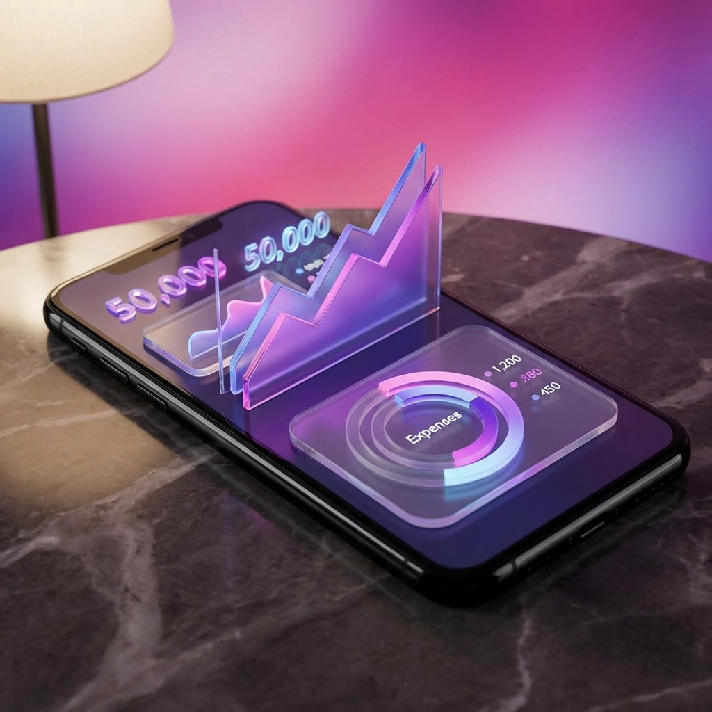
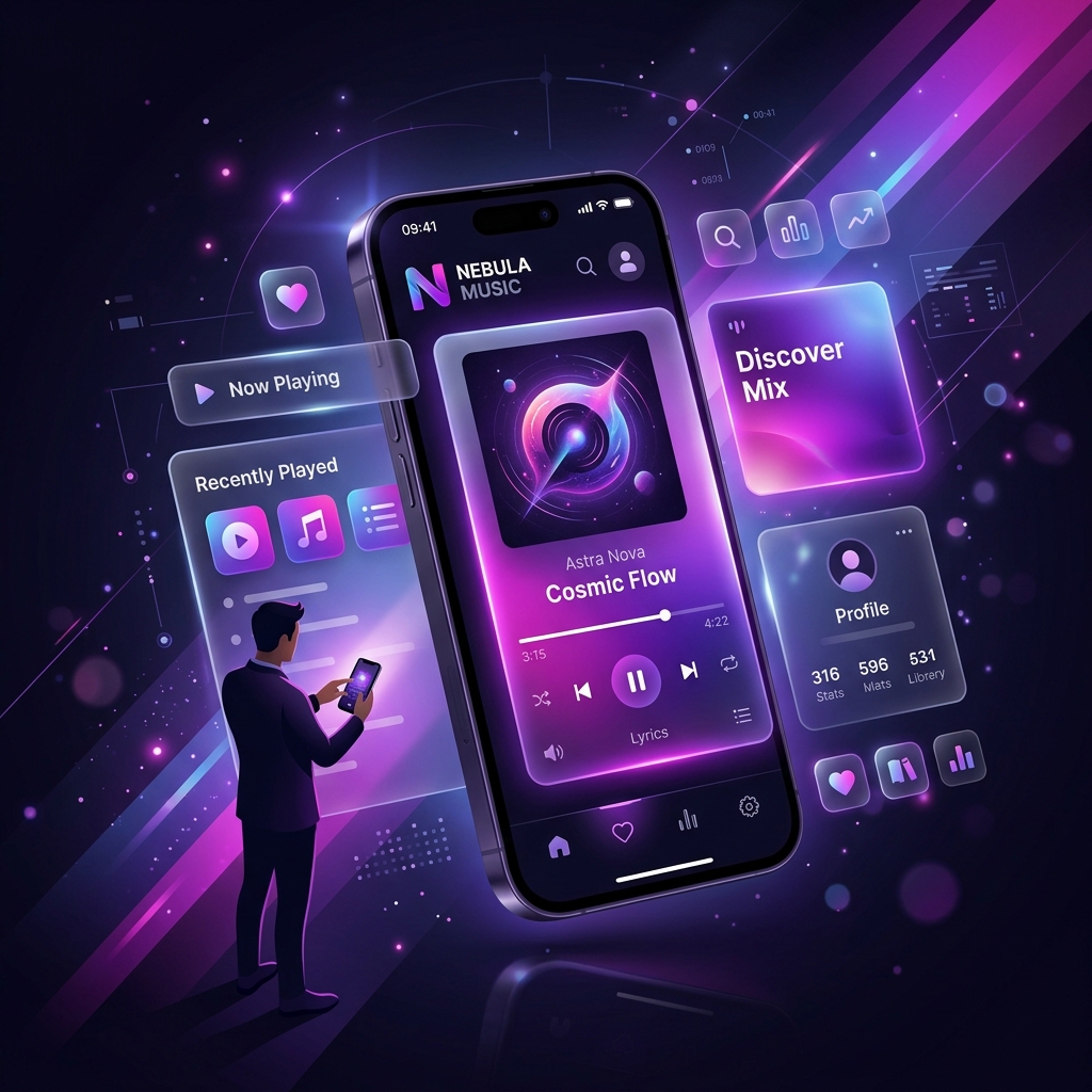
Our interface utilizes glassmorphism—a design trend characterized by translucent, frosted-glass effects that create a sense of depth and hierarchy. When you open a modal to add a transaction, the background softly blurs, focusing your attention precisely where it needs to be without losing the context of your dashboard.
Dark Mode: More Than Just a Trend
We didn't just invert colors for our Dark Mode. We carefully selected deep, rich slate tones mixed with vibrant neon accents (like our signature purple and magenta gradients). This not only reduces eye strain during late-night bookkeeping sessions but also makes your financial data pop off the screen.
Aesthetics Drive Engagement
Why does this matter? Because beauty creates engagement. If an app feels premium, smooth, and satisfying to use, you are exponentially more likely to form a habit around it. And in personal finance, consistency is the key to wealth.